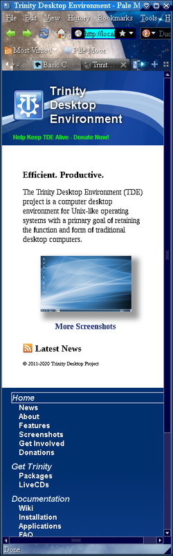
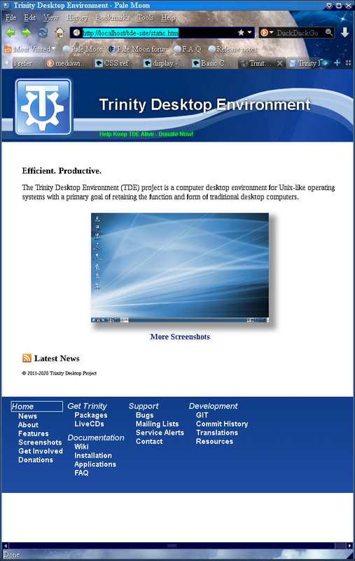
For your amusement (and to test whether I can actually *post* to the new mailing
lists, since I got the confirm and welcome mails, but other messages have only
been coming from the old list), I offer the following glimpses of what the tweaked
website will look like on smaller devices:

Really narrow screens (such as phones) will see this:

https://i.postimg.cc/m2tsMdWb/tdepage-phone.png

Note the vertical menu at the bottom, and the header has been resized so that
the word "Development" doesn't overflow off the screen to the right.

Screens between 520px and 800px wide (of which I don't expect to find
many—some tablets held in portrait mode, maybe) will get this instead:

https://i.postimg.cc/y6fKkM5Q/tdepage-medium.png

Menu horizontal at the bottom, header larger but still not full-sized.

At 800px, it reverts to the format we all know and . . . love?  In any case,
at 800px, the sidebar takes up a little more than 20% of the screen, which
should be acceptable to most.

The resizing trick doesn't work in Konqueror, unfortunately, since it doesn't
support CSS @media queries at the necessary level, but I am going to be
very surprised if anyone manages to get Konqueror onto a phone.  The page
does resize itself correctly on the three modern browsers I've tested.

E. Liddell
____________________________________________________
tde-users mailing list -- users@xxxxxxxxxxxxxxxxxx
To unsubscribe send an email to users-leave@xxxxxxxxxxxxxxxxxx
Web mail archive available at https://mail.trinitydesktop.org/mailman3/hyperkitty/list/users@xxxxxxxxxxxxxxxxxx
