But my skin tones DO click. They're creamy and gorgeous.
I'm sure they are :)
Color as viewed by you and I is not an issue of colormetrics - under a
flurescent light source, a person may be tinted green - but our brain
corrects for that and makes a person look normal - when you photograph it..
they should (in a colormetric sense) be rendered green... but neither you or
I will do that - we'll try to render their colors the same as we 'see' them
(brain corrected color) unless we're after the green for effect.
Same, a coke label will be a muddy red brown color - and colormetrics demand
that be accurately reproduced.. But we don't work that way. We work with
perceptual colors. So whatever color space you use, if you are correcting
*any* casts, you're working perceptually
The graphics guys work colormetrics. They do not care what the color cast
is, the coke red color should appear the same red as their pantone swatch,
irrespective of the light.. If the pantone swatch under a given light looks
the color of something that fell out the back of a dog, then that's the
color the coke can should look too. THAT is real color accuracy.
http://www.cambridgeincolour.com/tutorials/color-space-conversion.htm
this article talks of RENDERING INTENT - a good point.. the intent
determines the color space you work in.
You may well photograph in RAW.. but you will never get the gamut RAW
records onto an 8 bit monitor - the monitor, image program and graphics card
will 'squish' the colors to give you a rough idea of what was captured, but
they won't ever give you all the tones - there's simply not a monitor around
that can reproduce all that.
You may well capture in RAW or Adobe RGB .. but you'll never ever fit all
that you captured onto a print, any more than you ever stood a chance of
putting all that was recorded on a color neg onto a print. Think of the
times you had a lovely E6 image printed on Cibachrome and how wildly it
differed from what you expected.. what you saw on your projected
transparency - the gamut on E6 is narrow.. but it was still waaaay more than
could go down on polyester.
here's a comparison of gamuts:
http://upload.wikimedia.org/wikipedia/commons/thumb/1/1e/CIE1931xy_gamut_comparison.svg/512px-CIE1931xy_gamut_comparison.svg.png
as you can see, sRGB is pretty small. This makes it look bad to a lot of
people.
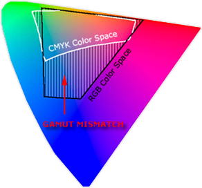
From the above linked article on intent you may have noticed this image:
http://www.cambridgeincolour.com/cms/wp-content/uploads/conversion_gamut-mismatch.png.pagespeed.ce.gMQiS237f-.png
see that even tinier CMYK colorspace - much smaller than the RGB colorspace?
thats pretty much all the colors you get to use in a print. MUCH tinier
than RGB.. is that badder than SRGB? no - that is all you will possibly be
able to use in your print. Sure you could have started with a massive
expansive color space.. you did - the real world's color space is near
infinite. You capture it in Abobe's color space or RAW if you like.. then
you discard and hack of about 50% of all the color data and throw it away.
sRGB is still vastly bigger than what you have available to you in your
print..
getting the point?
It really doesn't matter that much what color space you use - if the intent
i understood and the gamut is appropriate for display purposes then you'll
be fine.
.http://en.wikipedia.org/wiki/SRGB :
"sRGB is a standard RGB color space created cooperatively by HP and
Microsoft in 1996 for use on monitors, printers and the Internet"
"The sRGB color space has been endorsed by the W3C, Exif, Intel, Pantone,
Corel, and many other industry players"
