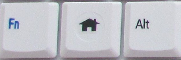
On Wed, Jan 27, 2021 at 4:35 PM Matthew Miller <mattdm@xxxxxxxxxxxxxxxxx> wrote:
>
> On Wed, Jan 27, 2021 at 10:46:44AM +0100, Lukas Ruzicka wrote:
> > [...] However, I am also supportive of  a symbolic button, because the
> > word "Start" has disappeared from Windows, too, if I remember correctly.
>
> I wish keyboards had a generic symbol on the Overview key, rather than
> literally the trademarked Microsoft logo. Because that's the obvious thing
> to put there.
>
> Failing that, I think there are two symbols that make sense:
>
>   ⋯ dot dot dot. The universal "there is more here". Android previously used a
>     double row of dots for its app drawer.
>
>   ☰ "hamburger menu". Yes, it's a cliche, but a familiar one, which is a good
>      thing. And apparently the unicode symbol often used to approximate it
>      is actually the trigram for Heaven, which is kind of awesome.

Once upon a time Acer Aspire One netbooks came with a cute little
house icon on their Super keys, at least the ones with linux.
Attachment:
acer_super_key.jpg
Description: JPEG image
_______________________________________________
desktop mailing list -- desktop@xxxxxxxxxxxxxxxxxxxxxxx
To unsubscribe send an email to desktop-leave@xxxxxxxxxxxxxxxxxxxxxxx
Fedora Code of Conduct: https://docs.fedoraproject.org/en-US/project/code-of-conduct/
List Guidelines: https://fedoraproject.org/wiki/Mailing_list_guidelines
List Archives: https://lists.fedoraproject.org/archives/list/desktop@xxxxxxxxxxxxxxxxxxxxxxx
