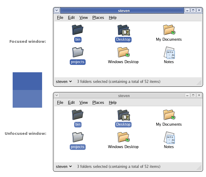
On Sun, 26 Sep 2004 20:16:23 -0300, Steven Garrity
<stevelist@xxxxxxxxxxxxxxxx> wrote:
> I've occasionally run into a situation where I mistake an unfocused
> Nautilus window in the background as the focused foreground window. The
> window title bar with Bluecurve makes a strong distinction between
> focused and unfocused windows, which is great.
>
> However, if you have icons selected in the *unfocused* window, you may
> notice that the unfocused icon selection color (that masks the icons,
> and becomes the background color of the icon title text) is very close
> to the icon selection color in *focused* windows.
>
> The two colors are different, but not by much. I would like to suggest
> making the unfocused icon selection color more significantly different
> than the focused icon selection color. Perhaps a bit lighter, and gray
> instead of blue (like the window title bar change).
>
> I've put together a screenshot illustrating focused and unfocused
> Nautilus windows and example swatches of the two colors in question:
> http://actsofvolition.com/images/screenshots/bluecurve-selection-focus.png
>
> I haven't worked on Gnome themes before, but some help and digging
> around turned up that this color is easy to change. In my Fedora Core 2
> install, the color is on line #36 of the file
> /usr/share/themes/Bluecurve/gtk-2.0/gtkrc
>
> I'm experimenting using a gray color (#b5b5b5) for a few days on my own
> machine.
>
> Depending on feedback to this post (welcome and encouraged), I'll file a
> bug (and maybe a patch).
>
> Steven Garrity


I like it.

Simple change that makes it easier to identify windows - who can
complain about that!
--
Martin


--

Fedora-desktop-list@xxxxxxxxxx
http://www.redhat.com/mailman/listinfo/fedora-desktop-list
