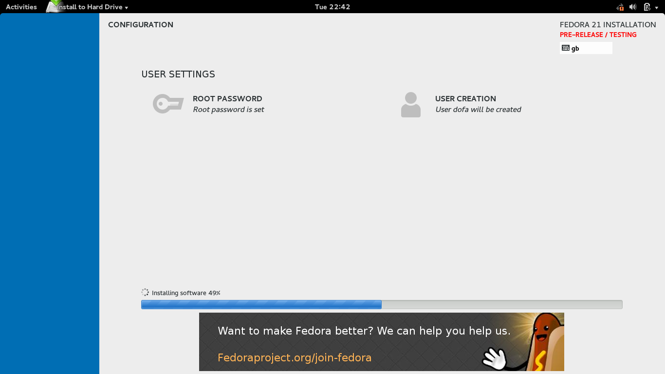
On Sat, 23 Aug 2014 18:30:15 +0100
Onyeibo Oku wrote:

>
> On Sat, 2014-08-23 at 13:03 +0300, Elad Alfassa wrote:we still need artwork
> for the installer sidebar, etcwe still need artwork for the installer
> sidebar, etc
> >
> > we still need artwork for the installer sidebar, etc
> > etc.
> You mean anaconda?  Absolutely
>
> I find the anaconda installation screen uneventful.  Lots of design
> oops (I mean redundant screen spaces, like the blue side bar having
> nothing on it OR the animated feature art taking an apologetic
> position at the bottom).  I actually took a screen-shot [1], did a
> little critique/analysis [2] and was hoping to propose some changes [3]
>
> [1]
> https://twohot.fedorapeople.org/design/ui/anaconda/anaconda-install-f21-rawhide-2014.png
> [2]
> https://twohot.fedorapeople.org/design/ui/anaconda/anaconda-install-ui-f21-critique.pdf
> [3]
> https://twohot.fedorapeople.org/design/ui/anaconda/anaconda-install-ui-f21-proposal.pdf
>
Since I'm not a fan of the whole anaconda UI redesign at all, I'll try to
keep constructive and less constructive feedback separate.

Within the concept, I have to say I like your proposal much better than the
original screen. Less wasted space, yet all the components have enough space
to breathe. Nothing screams at you (yes, that's what CAPITAL LETTERS usually
mean; use Small Caps if you want to be fancier than Title Case). +1 from me.

A bit of rant-like complain, probably non-productive, but I still want to
make some things clear:

* It's an installer for heavens sake, why is the UI so hugely parallel?
  Nothing is actually streamlined, I don't know what I have forgot to set
  up, I expect an easy ride with Next, Next, Next, i.e. a linear approach
  with skip-able steps. I used this installer a couple of times for Fedora 20
  and CentOS 7 and I still felt confused every time I used it. Unlike with the
  old Anaconda or even Windows installers.

* I really dislike the current trend for simplistic approach to artwork. I
  expect icons to have distinctive outlines, colours, not something that has
  only shape and that's sometimes really hard to recognize. I expect
  scrollbars and progress bars to be more than coloured (if I'm lucky)
  rectangles... But maybe I'm the odd one here. Half of the web looks like
  that... :-( That especially goes for anaconda. The icons in the installer
  are, IMHO, bland and blend with the background instead of standing out and
  attracting attention.

Sorry if I went too ballistic.

Regards,
Martin
Attachment:
signature.asc
Description: PGP signature
_______________________________________________
design-team mailing list
design-team@xxxxxxxxxxxxxxxxxxxxxxx
https://lists.fedoraproject.org/mailman/listinfo/design-team
