I thought at 24x24, the perspective and shadow still held pretty well.
I've attached a portion of the screenshot mockups I've posted earlier to
the wiki. It is the earlier version to assess the feasibility of the
project.
From David Neilsen's emails about sizes, I thought maybe the 24x24
should be simplified as well...but...as I look back and forth between
the two...I'm not really convinced. I might also be staring at this
stuff for much too long so...I'll just post the other version here for
discussion.
My feedback on the matter is...24x24 should remain in perspective, 16x16
definitely simplified and "flat". However there are also 18 and 22
sizes...22 are usually used in the panel area. In the attached mockup
are also a few 22x22 icons on the upper right area of the panel.
Dunno...I think they look ok as well. Maybe the break down point is
then at 18?
Diana


Joachim Frieben wrote:
Flat perspective at 24 pixels seems a bit exaggerated to me. The "Bluecurve"
icons work very nicely without this restriction. At 16 pixels however, that
is probably the way to go.
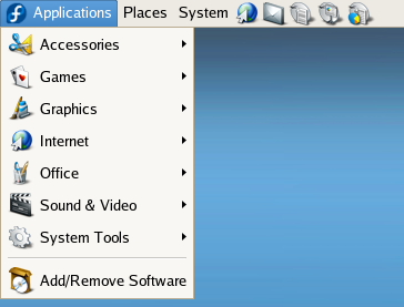
Attached is a preview of some of the work I've been doing redrawing the
icons with a flat perspective in a 24x24 pixel grid. The icons that
have not been scaled down in this mock are the 'Internet' and
'Add/Remove  Software' icons.
_______________________________________________

@xxxxxxxxxx
http://www.redhat.com/mailman/listinfo/
_______________________________________________

@xxxxxxxxxx
http://www.redhat.com/mailman/listinfo/
