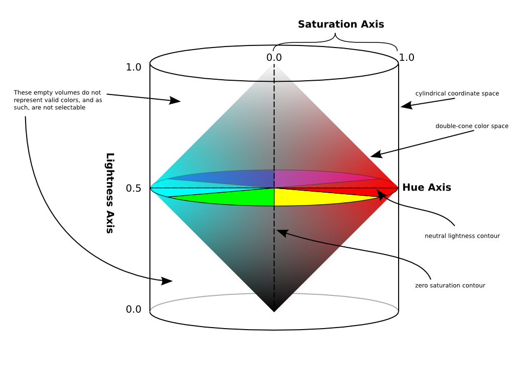
Omari Stephens wrote:> Robert Krawitz wrote:>>    From: Christian <info@xxxxxxxxxxxxxxxx>>>    Date: Sun, 31 May 2009 17:53:43 +0200>>>>    Hi Michael>>>>    The HSL is one of the best color models. The colors are symmetrical>>    ordered. >>>>    Advantages>>    1. symmetrical>>    2. color values are not rounded (you have more colors than in the HEX>>    model)>>    3. logical (no senselessly black axis)>>    4. equidistant colors in the color picker>>    5. the right color theory. In the middle is the neutral gray [1]>>>>    Bad's in the HSV color picker>>    1. not symmetrical>>    2. color values are rounded (in HEX a base color can have only a value>>    of 0 - 255)>>    3. not logical (a senselessly black axis)>>    4. not equidistant colors in the color picker, you can click too many>>    colors in the black area.>>    5. the color circle is correct but in the middle is not the neutral>>    gray.>>>> I favor HSL also, and it's what we use in Gutenprint to perform>> correction (actually, we perform parts of it in HL+G, but that amounts>> to the same thing).  I also added HSL decomposition to GIMP several>> years ago, and find it very useful -- a simple manipulation of the L>> curve can have a dramatic and predictable effect on the image.>>>> L conforms much more closely to perception than V, which is a major>> advantage when lightening or darkening an image -- in HSV space,>> there's no simple way to do that.> > The representation certainly seems useful.  My major concern is that, as a > photographer, "saturation" in HSL doesn't seem to usefully map to what we > typically call "saturation" (hereafter, "psaturation") — if I'm talking about a > "psaturated red sunset," a mostly-white sky with a touch of red isn't what I'm > describing.> > Put another way, a photographer's sense of psaturation is well-represented by > saturation in HSV.  In HSL, the concept of psaturation is split across both > saturation _and_ lightness — a color which is psaturated tends to have both high > HSL saturation and neutral lightness.> > Note, however, that the HSV and HSL saturation would align to a useful extent if > HSL coordinates were defined in terms of a cylinder, but the color space were > actually shaped like a double-cone (see [1]).  Or really, if it were any shape > with single points at full-lightness (white) and zero-lightness (black), and > with a circle/hexagon at neutral lightness.> > In that case, a color could only be described as "fully saturated" when it has > neutral lightness.  Colors that are between neutral lightness and extreme > lightness have gradations of saturation, and the saturation is bounded such that > it must decrease as you approach one extreme or the other (of lightness).  Of > course, when you do that, computations become harder.  *sigh*> > I'll send out a mockup of what I mean shortly.Mockup is here:http://ocaml.xvm.mit.edu/~xsdg/stuff/gimp/hsl-doublecone.png
Note that when I mention "HSL" below, I mean HSL with its traditional coordinate system, as depicted in [1].
Also note that this is a quick transformation away from the RGB color cube, [2], so many nice properties of RGB are shared by this representation.  The lightness axis is just one of the major diagonals of the cube.
I think this is a good representation for a couple reasons:  - It retains the advantages of HSL over HSV (primarily, the symmetry and the ability to move from a color with a certain psaturation to the equivalent gray).
  - It retains the photographer's sense of psaturation as its concept of saturation
  - Unlike both HSV and HSL, it compresses the volumes that are mostly-white and mostly-black.  This matches RGB's compression of those same volumes (see [2]), which is nice, assuming that images will be stored in RGBA of some bit depth. This also makes sense in terms of the colors that humans can perceive — we can more-easily perceive differences in highly-saturated colors than we can differences in mostly-white swatches with a hint of color.  Also, given that our brains correct for white-balance continuously, the difference between shades of white becomes even less important.  And given that our cones hardly work in the dark, the difference between shades of black becomes even less important.
  - Similarly to the previous point, this representation matches our perception well.  Consider any two points in this representation, in HSV, in HSL, and in RGB.  This representation and RGB are the only ones where the length of that path MUST correspond to the ease with which we can differentiate between the two colors at the endpoints of the path.  That is, the magnitude of a segment corresponds naturally to important aspects of our visual system.
  - It creates a bijection (a one-to-one mapping) between valid coordinates and points in the color space.  Put differently, there is no coordinate change you can make that will leave you at the same color.  This property holds for RGB as well, but not for HSV or HSL (in HSL, black and white are both circles; in HSV, black is a circle and white is a line).
Of course, there are always drawbacks:  - This requires more computation to use because of the "odd" shape of the space of valid coordinates.  That is, not all valid coordinates are valid colors.  - HSL and HSV are in wide use, and this is neither HSL nor HSV (though it's just a coordinate transformation away from both HSL and RGB)
> [1] http://en.wikipedia.org/wiki/File:HSL_HSV_cylinder_color_solid_comparison.png[2] http://en.wikipedia.org/wiki/File:RGB_color_solid_cube.png
--xsdg

_______________________________________________Gimp-developer mailing listGimp-developer@xxxxxxxxxxxxxxxxxxxxxxxxxxx://lists.XCF.Berkeley.EDU/mailman/listinfo/gimp-developer
