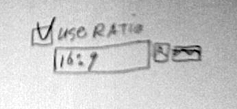
This is the specification for the rectangle + oval selection, and the
crop tools. It is based on the state of GIMP 2.3.13.

handling the rectangle on the canvas

The algorithm for the size of the corner handles as implemented
(handle height = rectangle height / 3, CLAMPed by 5 and 50,
 handle width  = rectangle width  / 3, CLAMPed by 5 and 50)
allows fast interaction, and shall remain as-is.

The areas between two adjacent corner handles is called a side
handle. The height of the two horizontal side handles shall be
exactly the corner handle height, the width of the two vertical
side handles shall be exactly the corner handle width. It is
incredibly important that this change is made: to allow fast
interaction by making the size of the side handles predictable.

The highlighting of all handle as implemented is good enough
for rock-n-roll. no change. After evaluating the flashing of
the side handles when you fly over them to get to a corner
handle, I say: not a serious problem, user is focussed on that
corner. Make a release and see how users get along with it.

When the mouse is over one of the handles, and one of the
up/down/right/left cursor keys is pressed, the rectangle
shall be resized by one (shift: 15) pixel in that direction.
incredibly important: the mouse pointer shall move the same pixels
in the same direction. This may sound forbidden but it is exactly
what the user needs.

Mouse over rectangle but not over handle? Like above, but move
(including the mouse pointer).

layer/canvas edges

It shall be possible to start a crop/selection rectangle outside the
layer/canvas. Unless 'allow growing' for crop is checked (see below) the
actual crop/selection rectangle shall be limited by the sides of the
layer/canvas, also while the mouse is still down (rubber-banding).
This is incredibly important for the 'use ratio' constraint.

For crop there shall be a new checkbox in the options panel:
'allow growing' (default: unchecked). Normally limiting cropping
to the exact edges of the layer/canvas has the highest priority,
hence the rules above. This checkbox overrides that, and the
layer/canvas can be size up by dragging a bigger rectangle
around it.

the 'use ratio' constraint and the shift key

Between the 'Expand from centre' and Highlight checkbox
there shall be the 'use ratio' control (sketch attached),
for the two select tools and crop.
It is a checkbox, combined with a single textfield and
the two portrait + landscape icons from the New dialog.
The textfield and icons shall be always displayed in the panel.

It is extremely important that the textfield shall be
a single textfield with no up/down arrows. This allows for
quicker input. The textfield shall accept the formats
A/B and A:B, where A and B are two floating point numbers.

The default value for the textfield shall be "1:1" for
the selection tools and
<current layer/canvas width>:<current layer/canvas height>
for the crop tool. When the user enters a value and confirms
it by enter/return or removing the input focus from the textfield,
this is the override value for this tool. It shall be displayed and
used for this tool for the rest of the runtime session, for every file.
This enable a pro to work 8 hours a day to cut out hundreds of 16:9
images.

This override value is cleared by clearing any numerical content from
the field before confirming. This resets to displaying and using the
default value for the tool.

When the checkbox is checked, the ratio shall be enforced while
rubber-banding a rectangle. Pressing the shift key while rubber-
banding shall toggle the checkbox in the other state.
The two icons shall be just icons, not in pushbuttons like in
the New dialog. Clicking one of the icons shall simply enforce
portrait or landscape in the textfield by swapping the two
number values when necessary.

the tool option panels

From all three tool option panels, remove all the Fix buttons,
The line with the Aspect fields, and the three buttons below it.

Selecting more than one of constant ratio/width/height actually
sets a constant rectangle size and this makes for wild, chaotic
rubber-banding behaviour. We could implement a radioing system
for these 3 constraints, but the complexity and UI bandwidth
usage is too much. So I chose the simple solution: specific
widths and heights shall be typed and confirmed by enter/return
or removing the input focus from the textfield. Clearing any
numerical content from a field before confirming shall just
restore the value displayed before the typing commenced.

All lines that contain textfields shall be sized such
that they just fit inside a tool option panel that is
6 tool icons wide (the default, I believe...).

The guides pop-up menu left side shall be aligned with
the left sides of the checkboxes, the pop-up menu right
side shall be aligned with the left sides of the textfields.

Highlight

When the Highlight checkbox is checked, then the darkening
effect shall not be displayed during rubber-banding. This
allows for precise adjustments.


Phew, I am going on my christmas holiday.
When needed we can discuss this during/at the 23c3...

    --ps

        principal user interaction architect
        man + machine interface works

        http://mmiworks.net/blog : on interaction architecture

_______________________________________________
Gimp-developer mailing list
Gimp-developer@xxxxxxxxxxxxxxxxxxxxxx
https://lists.XCF.Berkeley.EDU/mailman/listinfo/gimp-developer
