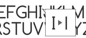
As I mentioned in the meeting yesterday, I love the way Comfortaa looks and I think it goes well with the Fedora logo, the only problem I have with it is the way the capital "i" looks. The font is very "modern" looking overall which I think fits well with the Fedora look, but those serif-like stubs on the "i" just don't gel with that in my eyes. They also don't fit the rest of the font, I think. If we could modify the font to drop those, it would be perfect. I've attached a mockup....
What do you think?
Fab
# Fabian A. Scherschel
# Host & Producer, Sixgun Productions
# Member, Fedora Design Team
Attachment:
comfortaa.png
Description: PNG image
_______________________________________________
design-team mailing list
design-team@xxxxxxxxxxxxxxxxxxxxxxx
https://admin.fedoraproject.org/mailman/listinfo/design-team
