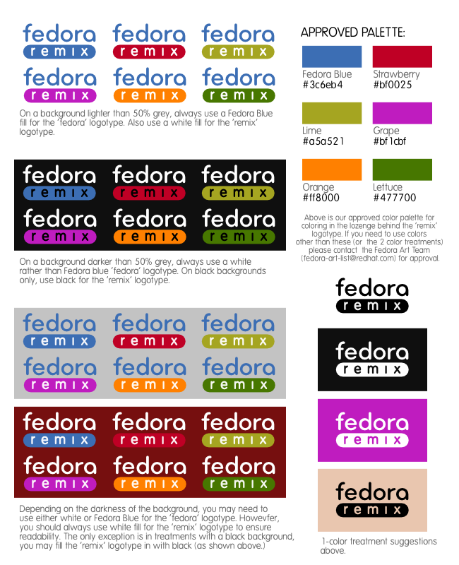
Paul W. Frields wrote:
> On Fri, 2008-10-17 at 10:24 +0300, Nicu Buculei wrote:
>> Máirín Duffy wrote:
>>> I would like to see the rounded logo done up with all these
>>> colors to make sure they don't make the 'remix' text too
>>> hard to read. If they don't that's what I recommend we go
>>> with. Does that sound reasonable?
>> Your wish is my command :p
>> https://fedoraproject.org/wiki/Image:Fedora_secondary_logo_drafts_nicubunu_color2.png
>
> Very nice!

Way to go! I think these look great.

Using this, here's my stab at an initial (albeit sparse) set
of guidelines:

https://fedoraproject.org/w/uploads/2/29/Fedora_secondary_logo_draft_guidelines.png

(I changed the blue lozenge to the lighter Fedora blue so it
would stand out on dark backgrounds better.)

~m

_______________________________________________
Fedora-art-list mailing list
Fedora-art-list@xxxxxxxxxx
http://www.redhat.com/mailman/listinfo/fedora-art-list
