Ian Weller wrote:
On Wed, Aug 13, 2008 at 02:17:36PM -0400, =?ISO-8859-1?Q?M=E1ir=EDn_Duffy_ wrote:
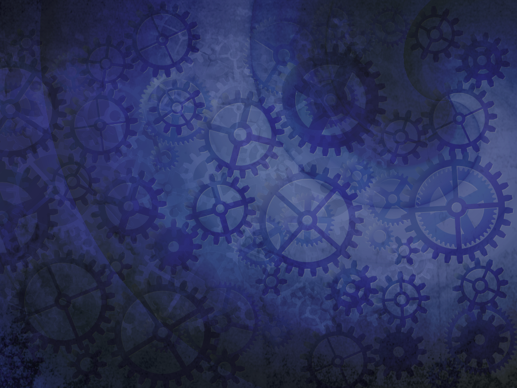
http://duffy.fedorapeople.org/temp/gears-blueswirl-normal2.png
Re: the colors - they should be easy enough to adjust. This monitor I
have at work, I think the colors are a bit off so I may need to adjust
when I get home where I think my laptop lcd surprisingly has better
colors.
I think the colors are a bit dark for Fedora. Something with a more
Nodoka-default-blue feel would be much nicer IMHO. Of course, we can
play with this with time-changing wallpapers and whatnot.
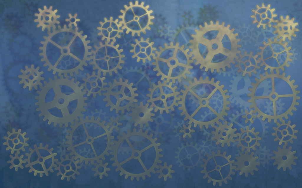
Yeh if the darkness is an issue this is pretty easy to address:

http://i61.photobucket.com/albums/h58/mairinduffy/gears-blueswirl_steampunk_screened.png
It also seems like there's too many gears and the desktop, as a whole,
is distracting.
Maybe they could be made more sparse for the desktop but dense for the
banners/splashes for the rest of the artwork set?
Or maybe we could have another focus besides just gear cogs?

~m

_______________________________________________
Fedora-art-list mailing list
Fedora-art-list@xxxxxxxxxx
http://www.redhat.com/mailman/listinfo/fedora-art-list
