Max Spevack wrote:
On Wed, 30 Jul 2008, Nicu Buculei wrote:
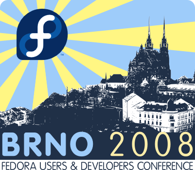
But honestly, I personally love it as is. This one is Max's baby
though... :-)
Yeah, I asked for some opinions on list before going to Max (but who
I'm kidding? Max is also watching the thread).
I think it looks awesome. I echo Paul in wondering whether or not the
end result will have sufficient detail... I suppose that is a question
we have to ask the manufacturer of the shirts, who has yet to be
identified. But in general, i think that is an incredibly cool design.
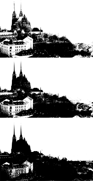
Reducing details is not hard, I attached an example (traced.png) of how
it look with various parameters for the trace option.
And on top of that, it can be simplified by hand a lot.
Mo's comments were good too. So more or less, I second all the
constructive comments in this thread.
Tried to use some of her comments along with a closer frame, more focus
on the cathedral, less on the background buildings, not sure which works
better (and I still like her Boston image better).
Was the original picture one of Jay Turner's?
Yes, if he is "rhlinuxguy" on flickr -
http://flickr.com/photos/linuxguy/2098670932/
As you can see, I flipped the image horizontally for the composition.

--
nicu :: http://nicubunu.ro :: http://nicubunu.blogspot.com
Cool Fedora wallpapers: http://fedora.nicubunu.ro/wallpapers/
Open Clip Art Library: http://www.openclipart.org
my Fedora stuff: http://fedora.nicubunu.ro


_______________________________________________
Fedora-art-list mailing list
Fedora-art-list@xxxxxxxxxx
http://www.redhat.com/mailman/listinfo/fedora-art-list


