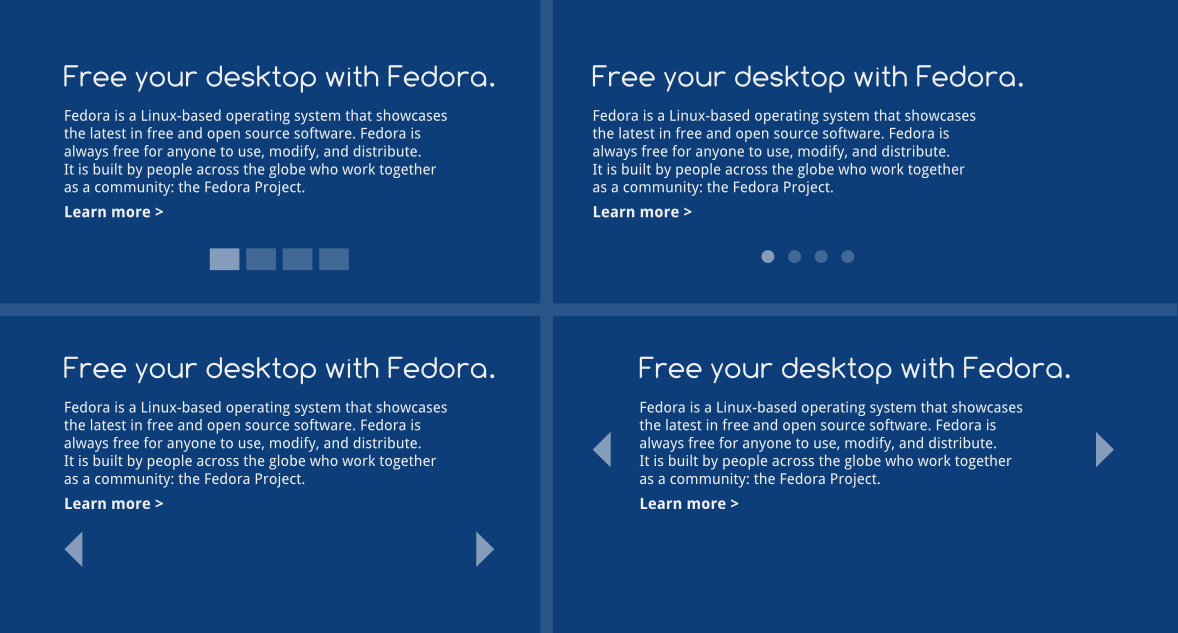
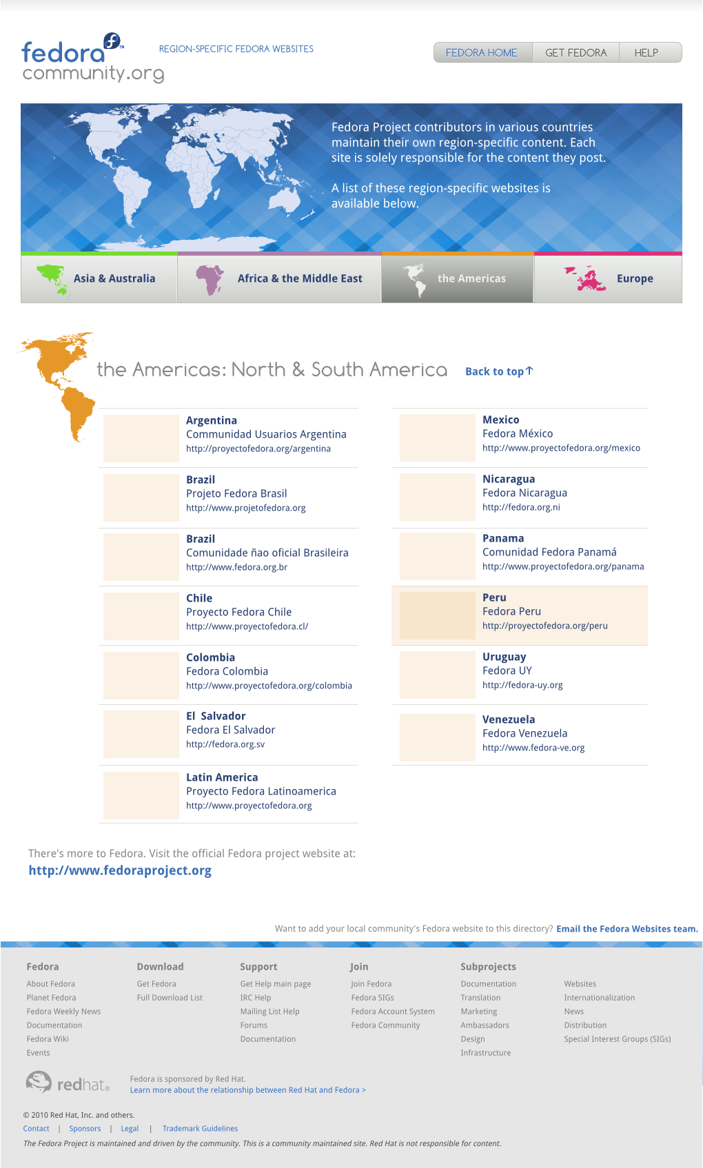
2010/7/30 Máirín Duffy <duffy@xxxxxxxxxxxxxxxxx>:
>
> The making the page super grey/white neutral to make the blue pop was my
> compromise. But maybe it makes the page too lifeness / not blue enough.
> If the slideshow automagically changes, maybe there is less harm in
> detracting from the download button's pop if only one or two of the
> slides is blue. (And the mockups you did, Jef, are gorgeous. I like the
> 3rd and 4th best!)
>

I do agree that too much grey/white sorta makes the pages look bland.
Having the accent color being blue is fantastic but i would warn
against overusing it. I think using more of the secondary colors (as
in the Branding Guideline) would be good.. but maybe just using
pictures/images that aren't blue-centric would give the page enough
color.

>
>> * The slideshow buttons
>>
>>
>> http://schendje.fedorapeople.org/fpo/fpoSlides.png

I like the square one on the top left for 2 reasons
1 - its big enough to click on
2 - it tells the user how many screens there are

Browsing around several tv/network websites (as they all seem to have
a variation of a slideshow), i saw some that were vertical and others
were on the corners of the screen. It just something to think about.

>
>> * Screenshot
>>

I really like the Alternative Slideshow banners in the Mockup #1
(http://mairin.wordpress.com/2010/07/29/fedoraproject-org-front-page-redesign-mockup-1/).
I think it really shows off Fedora and its capabilities and features.
I do agree that Desktop screenshots are kinda boring.

>
>> * The grey gradient all the way at the top
>>
>> I'm just wondering why it's there. Could you shed some light on this, Máirín? :)
>
> I know Sijis doesn't like it from the fedoracommunity.org mockups, we
> talked about it before. :)

Should i say more??
I understand the idea of starting a page with softly.. but its grey
and i honestly don't think it would make a difference.
I like simplicity.


Jef - you've done a great job doing those mockups. Please keep them coming.
Mizmo - you are the best!

Although not truly related but i love the Fedoracommunity mockups
because of the awesome use of color
(http://duffy.fedorapeople.org/webdesign/fedoracommunity.org/fedoracommunity.org.9.png).

Overall, i think the mockup for fp.o is awesome. Leaps and bounds
better than we have now.

Sijis

Sijis
--
websites mailing list
websites@xxxxxxxxxxxxxxxxxxxxxxx
https://admin.fedoraproject.org/mailman/listinfo/websites
