Hi All,

In my continuing efforts to get WeatherScope running flawlessly under
Wine, I've noticed issues with WeatherScope's built in color chooser.
When you run the program, by default a map of Oklahoma appears.  If you
right click on the entry in the legend (on the left side) and select
properties, you have the option of choosing the color.  If you click on
the small color button, the program pops up a "widget" that has a grid
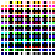
of colors to choose from, not the standard color picker.  Under windows,
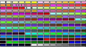
this widget has a bunch of _square_ color boxes and allows you to click
on a box to select that color.  Under wine, however, these boxes are
elongated horizontally, the refresh of the widget as you move the mouse
is not performed correctly, the boxes are not highlighted correctly
based on the mouse position, and the correct color is not selected when
you click the mouse.  It appears that the color that is selected when
you click the mouse is correct for the position of the mouse, but does
not match the color that is displayed in that region.  This is
corroborated by the fact that it appears that the mouse highlight tries
to lock on to regions between two of the displayed boxes.  I think the
drawing of the boxes and the mouse highlight simply have the incorrect
size, nothing more than that.  I've attached screenshots of the basic
widget under WindowsXP and Wine-20050419.

(WeatherScope is available at:
http://sdg.ocs.ou.edu/builds/final/win/WeatherScope/WeatherScope-1.2.1.exe)

Anyone have any idea where the drawing for this "widget" might take place?

Ryan

--
Ryan May
Graduate Research Assistant
School of Meteorology
University of Oklahoma


