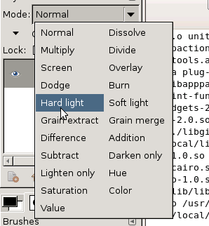
One of the minor annoyances of using Gimp is that the Layer Mode
menu (and paint mode menu, etc) is unpleasantly long -- for me, it
nearly extends from the top to the bottom of the screen.  It
would actually be very easy to change the code so that these menus
are laid out in two columns, and in my opinion they look nicer that
way.  I am attaching a screenshot showing how it looks.  (Hopefully
the attachment will come through.)

I should say that the disadvantage is that it's hard to maintain the
separators that divided the modes into categories -- it would be
possible, but coding it would be a significant pita.  It seems to me
that the separators are not that important, because the categories
are pretty artificial in the first place, and were really imposed mostly
to give the very long list some structure, as far as I can see.  But this
is something that you should consider.

Anyway, I would like to make this change, and I wonder if there are
objections.

  -- Bill
Attachment:
twocol-menu.png
Description: PNG image
_______________________________________________
Gimp-developer mailing list
Gimp-developer@xxxxxxxxxxxxxxxxxxxxxx
https://lists.XCF.Berkeley.EDU/mailman/listinfo/gimp-developer
