Hey folks,
So in the marketing meeting we briefly discussed the status of the Four
F's posters and such. I think the best idea is to use the design of the
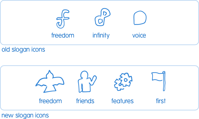
three fedora principles posters we have now, but instead make them focus
on the four F's, and replace the Fedora logo parts in the posters with
icons specifically drawn to represent the four f's.
I've attached a rough sketch of my suggestions for the ideas. They are
rough sketches so discussion can focus on the concepts rather than the
rendering. Features was the toughest one - but let's talk through them
all if you have any issues with them conceptually and come up with the
best representations.
Sound cool? :)

~m

--
Fedora-marketing-list mailing list
Fedora-marketing-list@xxxxxxxxxx
https://www.redhat.com/mailman/listinfo/fedora-marketing-list

