Mario Pascucci wrote:
>
> Dejavu sans condensed is equivalent in size to default Sans font. With
> Dejavu sans the text is more or less 10% wider than default Sans, with
> same vertical size.
>
> Probably I'm the only one in the world with this strange behavior... ;-)

Maybe you are not.

DejaVu Sans is quite wide; it is known that wider fonts are also more
readable, but, in a certain way, wider fonts are cheating, as the fonts
are using more pixels (size is only defined vertically).

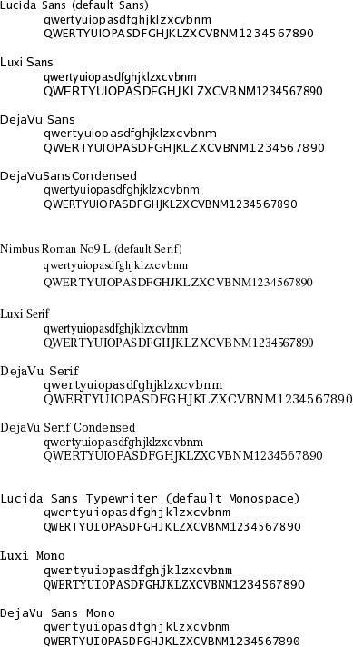
I attach a quick comparison between default FC5 fonts, Luxi and DejaVu.
(image rendered for RGB LCD by OpenOffice)

My comments:

- Sans: DejaVu is larger than Luxi Sans (Mario are you using Luxi as
the default Sans font?). Overall, the DejaVu quality is good.

- Serif: DejaVU is using more horizontal space than Luxi and more
horizontal and vertical space than Nimbus. In this way, it achieves
a very good quality.

- Mono: DejaVu is very similar to Lucida Sans Typewriter. IMHO Luxi
Mono is more readable as I find serifs very useful at small font
sizes and a monospaced font is typically used for terminals, where
the font is often small. I'd like to have a DejaVu Serif Mono.

I'd say DejaVu is very good, but I think I will prefer Luxi Mono
as a Monospaced font.

Well, when it will be selectable by KDE apps, as it seems
Luxi Mono is not recognized as monospaced.
Maybe it happens because there are some widths=653 instead of 600 in
  /usr/share/X11/fonts/Type1/l047016t.afm
and
  /usr/share/X11/fonts/Type1/l047036t.afm
Is that related to
  http://lists.kde.org/?l=kde&m=110617132115635&w=2
?
Where should I file a bug about that?

Best regards.
--
   Roberto Ragusa    mail at robertoragusa.it
--
fedora-devel-list mailing list
fedora-devel-list@xxxxxxxxxx
https://www.redhat.com/mailman/listinfo/fedora-devel-list

