It occurred to me the other day that part of what bothers me is the soft color scheme. They don't look clickable like all other GTK buttons do, and I think it's because they aren't the matching bluecurve "metal/chrome".
I've done a quick mockup to show the bluecurve window controls as chrome, rather than the blue-ish versions in there now: http://actsofvolition.com/images/bluecurve_experiment.png
The trouble is, it's a little more utilitarian looking - though I do think the controls look more clickable. Thoughts, comments, and criticism are all encouraged.
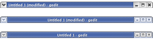
Also, for reference, here's a screenshot showing the bluecurve classic, current bluecurve, and my mockup controls all together: http://actsofvolition.com/images/bluecurve_windowcontrols_compare.png
Thanks,
Steven Garrity
