Hey Vratislav!
I wanted to point out we did have a mockup that would enable two layout
selections, here:
https://bugzilla.redhat.com/attachment.cgi?id=621060

(from https://bugzilla.redhat.com/show_bug.cgi?id=859465)
The mechanism for determining whether or not a layout is default or not
is whether you use the main ui to set it up or a lightbox to add it and
it appears in the secondary bucket below.
I'm not saying we need to do that now, just that it might be interesting
to look at now and maybe provide some ideas.
There's also the gnome-control-panel way of doing it which is also
interesting (although it doesn't seem to have as many layouts?)
On 01/23/2014 09:07 AM, Vratislav Podzimek wrote:
in the lifetime of Fedora 18, 19 and 20 there have been some serious
issues identified in our Keyboard spoke. The main issue is that with a
one-level layout selection, it is not possible to list keyboard layouts
for multiple languages (thus e.g. Belgian layout was not listed as
Belgian, but as Dutch, because those two languages both use the layout).
The other issue is that it's not obvious which of the layouts will be
used by default (as the VConsole keymap) and last but not least it is
not possible to preview the layout before adding it.
Okay. I'm not sure if I understand the first problem - can one layout
only be listed under one language/locale? And the Belgian layout was
only shown under Dutch instead of Belgian?
For those reason, I've started thinking and working on the new version
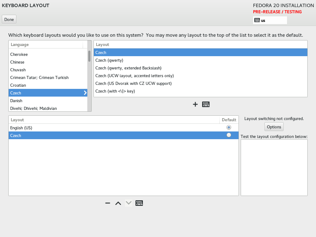
of the Keyboard spoke. The following link shows what I have right now:
http://vpodzime.fedorapeople.org/reworked_keyboard_spoke.png
Issues I'm aware of (and didn't make implementing them today):
* there should be descriptive labels visually splitting the screen into
two parts (something like "Available layouts:" and "Keyboard
configuration:")
Yeh, I think right now there's too many panes; there's two for drilling
down to the layout, then a third for specifying the order of the layouts.
I think maybe we could get that down to two if you could make one
drilldown pane using an inlay (see
http://designinginterfaces.com/patterns/list-inlay/ ) which you could do
with a treeview disclosure triangle, then the second would be organizing
the selected layouts?
* the default layout should be bold
That's a good idea.
* layout switching label should be more visible (italics?)
I think it's lost just because the screen is a bit cluttered. I think it
will be helped if we can de-clutter a little bit.
* the + and - buttons are probably not so catching as they should be
Yeh, I'd use that little bar that's anchored to the bottom of listviews
in a lot of the gtk3 panels; we have one on the bottom of the left-hand
pane in custom partitioning, for example.
   - Should the testing area and treeview with added layouts be swapped
     and the +/- buttons replaced with the up/down arrows?
Hmm. Well there's two tasks here: finding potential layouts, and then
ordering the ones you chose. Kind of like, picking out products you like
on the shelf at the grocery vs sorting / putting away the groceries you
chose when you get home.
I think the testing area is maybe more related to choosing which layouts
you want - e.g., "Does this layout have the '@' under '2' or is it a '"'
under '2' ?" So it might make more sense to group the testing area with
the layout selection area.
The options for setting up layout switching seems like it should be
grouped with the final selections.
- or should they be marked as important and thus have the blue colour?
I wouldn't do the blue color on the buttons; I think it's only meant to
be used on one button per screen and it'll already be on the Done button.
Here's a (tiny, weird font) mockup that uses the newish Gtk Listbox a
*lot* -
http://linuxgrrl.com/fedora-ux/Projects/Anaconda/Sketches/Keyboard/keyboard-2.png

Let me walk through it, tell me if it's nuts:
- You start with the left pane. You scroll to and hover over a language
of interest. When you hover, an 'expand' link appears.
- Click on 'expand' and the full list box comes into view with the list
of layouts that apply to the language. Hover over a specific layout and
you'll see an add button and an arrow button.
- You click on the arrow button and you get a dropdown that lets you
test the layout or view it.
- Select test it, and the test area below lights up and comes into
focus, you start typing, and the text shows up in the test area. When
you are done testing you can hit tab to change keyboard focus or mouse
somewhere else.
- Select 'view layout' and you get a lightbox with a diagram of the
layout, which you can click on to dismiss.
- Press the 'add' button and the layout is added to the list on the right.
- Then let's go to the right pane. The default layout it marked with the
'default' icon on the left.
- Hover over a non-default layout, and buttons will appear: set default,
or remove.
- Click set default, the default icon will disappear from the current
default and move to the one you just set as default.
- Click remove, and the layout will be removed from the right pane list.
- The options in the bottom right operate the same as now.

~m

_______________________________________________
Anaconda-devel-list mailing list
Anaconda-devel-list@xxxxxxxxxx
https://www.redhat.com/mailman/listinfo/anaconda-devel-list
